Atlas Translations Rebrand Announcement
We are pleased to announce the launch of our rebrand!
More than “just making things look pretty”
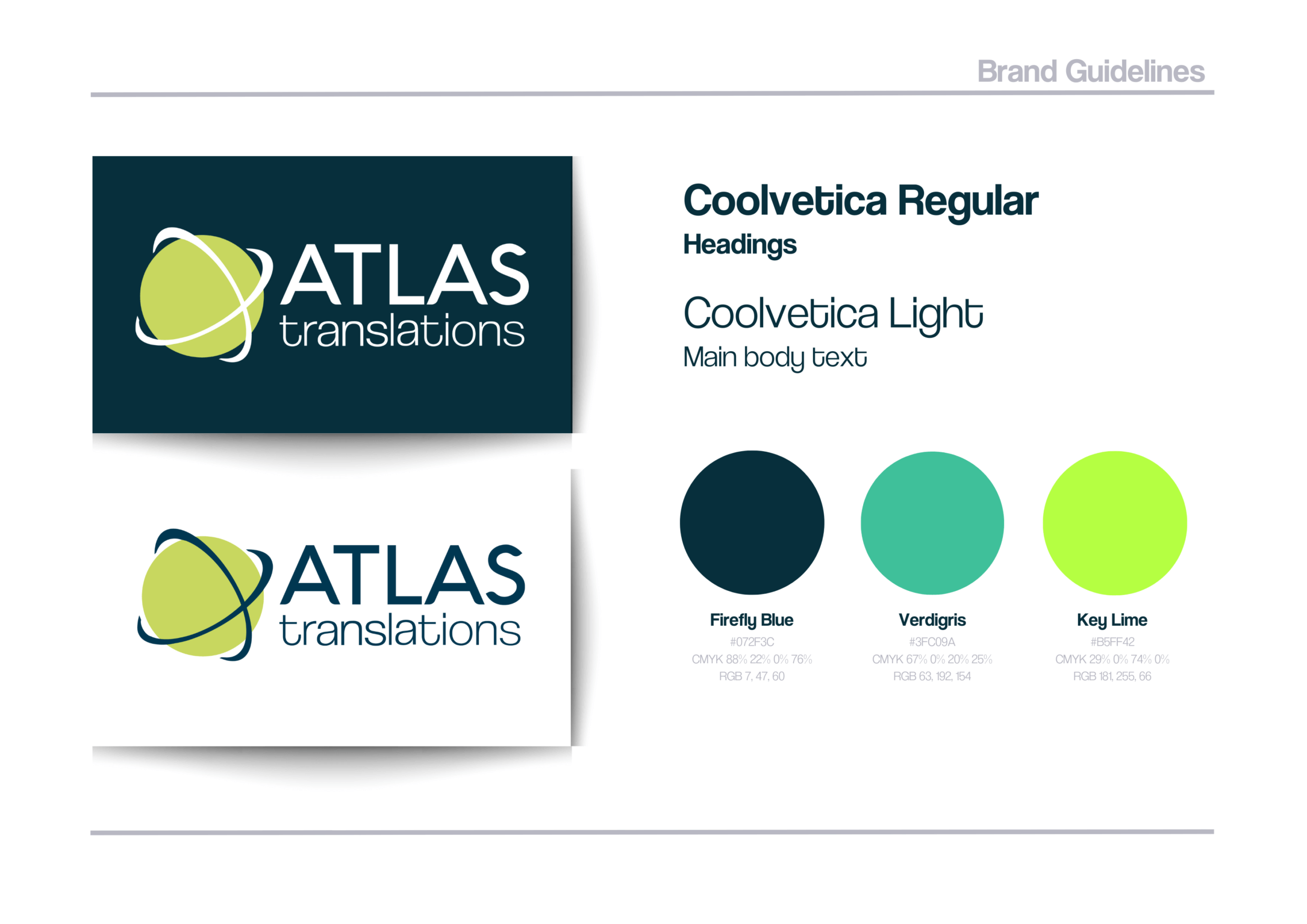
Our rebrand is very much an evolution of our pre-existing branding – rather than a complete revolution! Keeping our recognisable Atlas planet but adapting our logo, colour palette, and typography, we now have a clean, modern look that reflects the value of our high-quality services, as well as the human and friendly touch for which we are known.
“A high-quality, professional and consistent brand helps you to reflect the quality and professionalism that you provide with your services, products…whatever it may be. Good branding is SO much more than just making things look pretty” says Charlie, Atlas Translations’ Marketing Manager. “When done well, a good brand can help you to build trust, make conversions, and retain clients.”
A rebrand that moves with the times
With increased demand for services such as remote interpreting, translation of e-learning materials, and integration of machine translation (to name a few!), we are constantly tweaking our service offering at Atlas. What we do as a translation agency has developed and changed quite substantially since we last looked at our branding, so it only felt right to give it a bit of TLC!
Atlas gets a facelift!
Where company marketing materials used to be restricted to leaflets, possibly a website, and maybe (for those old enough to remember) a section of the Yellow Pages, there are now endless opportunities to promote your business. From social media channels, to industry directories…our translation agency is present on a vast range of channels. It therefore felt important to develop a set of brand guidelines to ensure we are maintaining consistency across all channels.
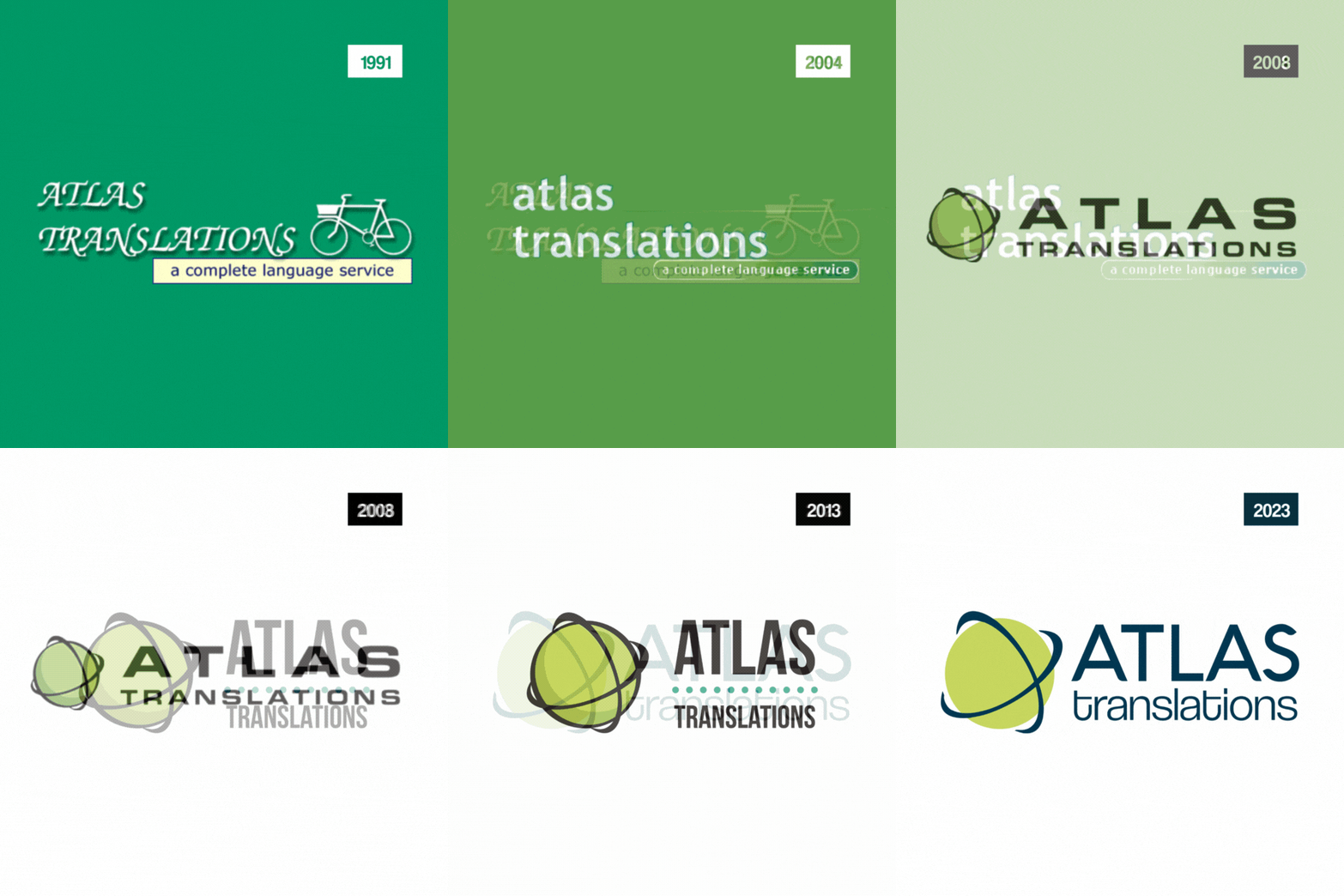
We feel very nostalgic seeing how the Atlas logo has evolved since our inception in 1991!
Our signature colours and typography
Our signature blue and green colours echo the land and sea of an Atlas map, and we like to think our San Serif typography, Coolvetica, is as easy to read as we are to work with! The extra-tight kerning of the font mirrors our tight-knit team, the funky curls adding a bit of personality and reflecting our friendly and human touch. The font also supports many writing systems, including Latin-based European languages, Vietnamese, Greek, and most Cyrillic-based writing systems – handy for a translation agency!
Building a global brand?
If you’re also undergoing a company rebrand and you want to appeal to an international audience – or perhaps you have a few overseas conferences and meetings in the calendar! – consider localising your marketing materials. A business card or rollup banner in the language of your target market may well just be the ticket to opening up valuable prospect opportunities.

